
Track your performance
The Analytics view aims to help you make the right decisions regarding incident remediation. The graphs and charts disclosed in that view provide an overview on:
- The remediation progress and identify opportunities for improvement
- Your dependencies composition to help you understand where you should focus on.
Filters and observability periods
Before diving into the diagrams information, it’s important to highlight that charts and graphs of the Analytics view are filtrable using:
- Language of the dependency,
- Incident severity,
- Incident source,
- Source criticality.
You can also adjust the observability period, using preset ranges or custom date selection.
The default time range is Last month. You can change the
time range in the top right-hand corner of the page. For stat metrics,
GitGuardian compares metrics with 30 days previous period
Depending on the observability period selected, you can group elements by day, week, or month (e.g., monthly grouping will not be available in case the preset period is Last week).
Please note that GitGuardian captures a snapshot at the end of the observability period, meaning that each incident is counted in its state at the end of that period.
Track incident volumes and remediation trend
Because the incident’s severity matters in prioritization, GitGuardian chose to break down the incident’s information into severity categories in most metrics and graphs.
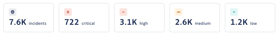
Incidents cards board
The five cards provided at the top of the Analytics view give a quick heads-up of the total number of opened incidents in that period, broken down by severity.
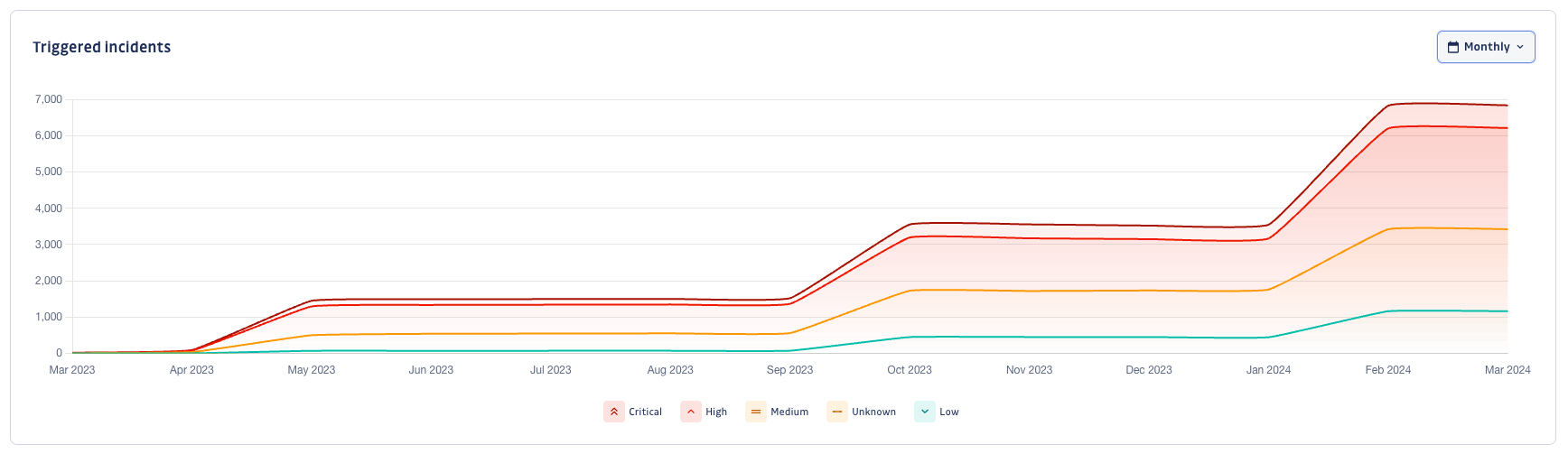
Triggered incidents
The Triggered incidents graph shows the total remaining triggered incidents, helping you see both volume and remediation trends simultaneously.
This graph is crucial in lowering your exposure and safeguarding your applications in the long term.
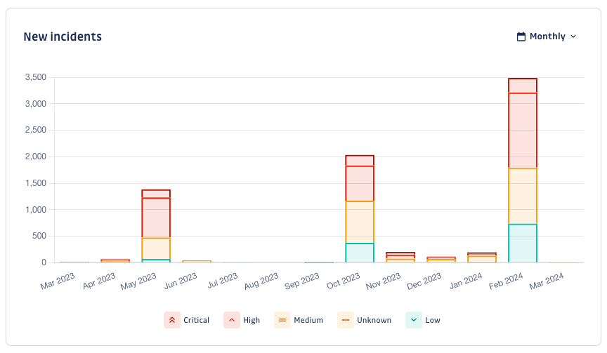
New incidents
The New incidents graph shows the number of newly triggered incidents in the observed period. Focusing on freshly introduced incidents allows you to identify specific events, like new sources added, new dependencies added, or new vulnerabilities discovered.
It should also help you see if your prevention strategies (e.g., preventing the introduction of dependency vulnerabilities from your CI pipeline) have paid off or if you still have areas for improvement.
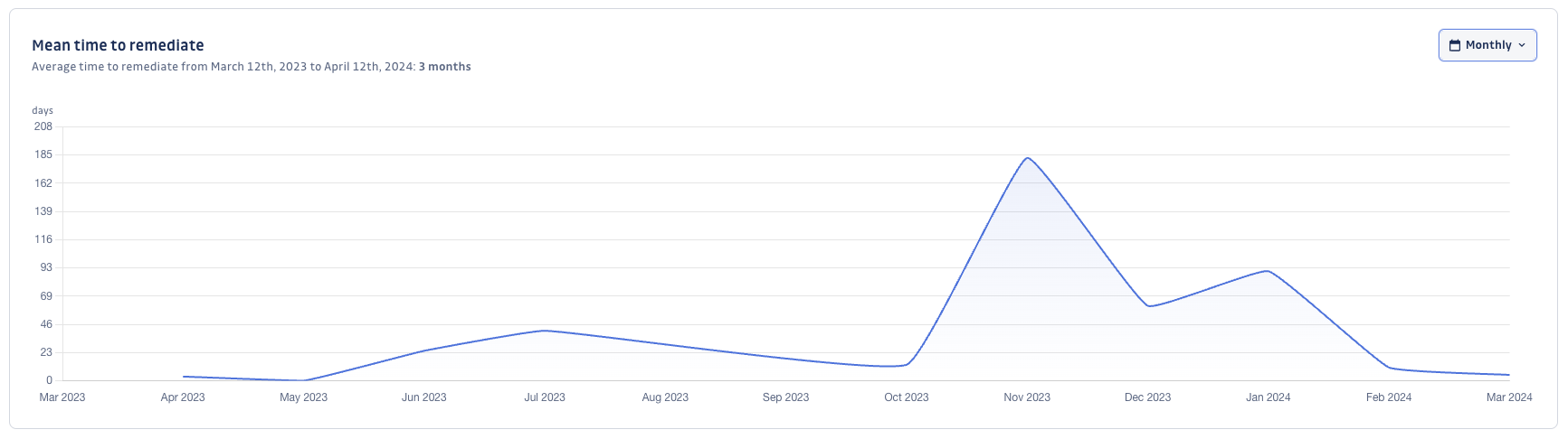
Mean time to remediate
The Mean time to remediate graph significantly helps you assess if your organization is improving its remediation SLAs. Likewise, for the New incidents graph, you may see whether your prevention strategies were beneficial.
The graph captures the mean duration of resolving or ignoring an incident.
Analyze your dependency composition
GitGuardian's objective is to help you make better decisions in your remediation process. To that end, the view comes with helpful charts to understand your dependencies perimeter.
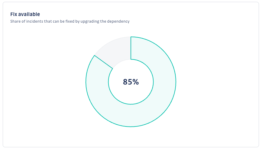
Fix availability
The Fix availability chart shows the share of incidents where a fix is available.
Simply put, it helps you assess the share of incidents you can remediate by upgrading the dependencies involved.
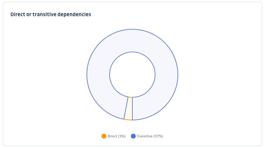
Direct or transitive dependencies
The Direct or transitive dependencies chart gives the distribution of direct and transitive dependencies incidents.
Knowing that you can lead measures to remediate direct dependencies incidents, looking at this chart can be important to seize the remediation effort.
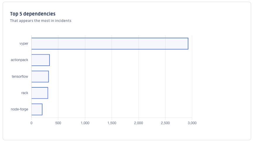
Top 5 dependencies
The Top 5 dependencies chart shows the dependencies that appear in most of your declared incidents. It will quickly help you identify the most problematic dependencies and tackle them as a priority.
The horizontal axis provides the number of incidents per dependency.
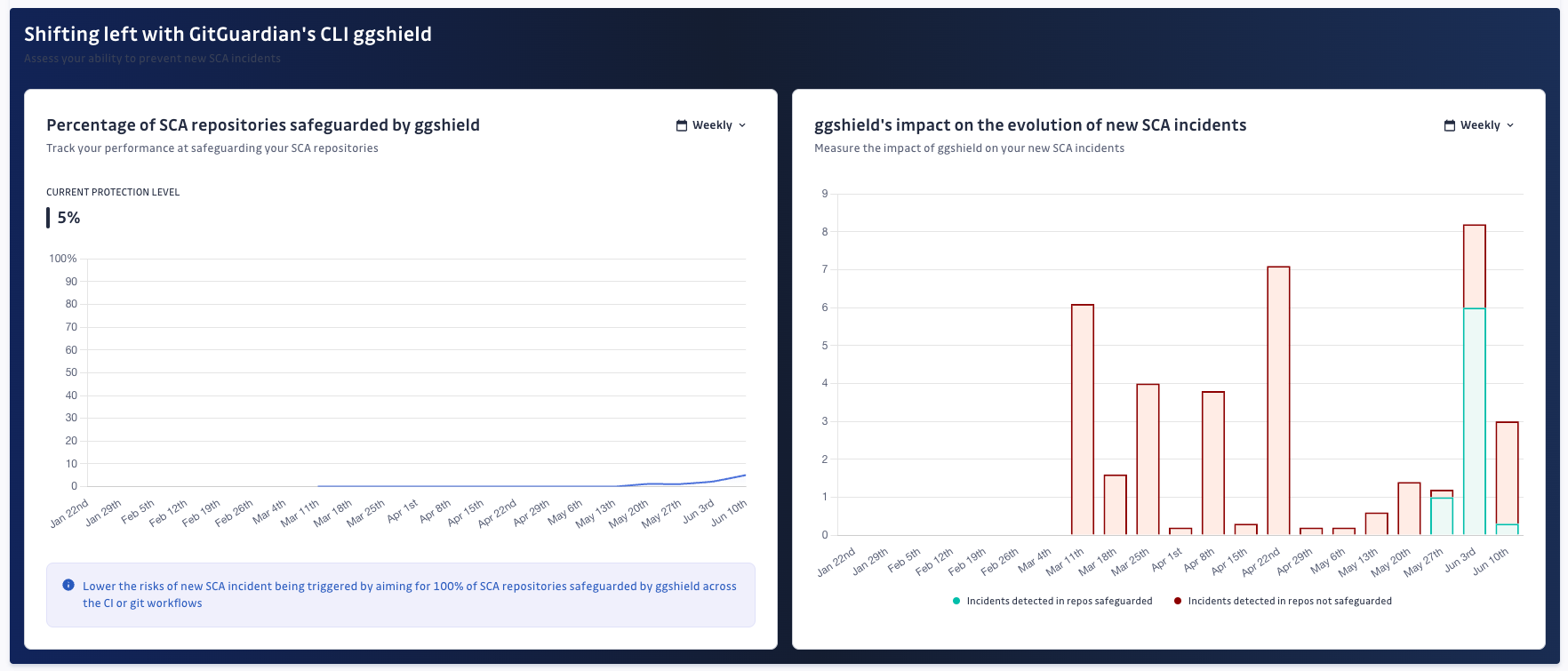
Shifting-left Analytics
What does 'safeguarded' mean?
In the context of SCA, a repository is deemed 'safeguarded' when it is scanned using ggshield. This process helps you ensure that your open-source risk is regularly assessed by proactively scanning and preventing new vulnerabilities from being introduced in your repository.
How to safeguard with ggshield?
Safeguarding takes place through one of two following methods:
CI/CD pipeline integration: When ggshield is integrated into your CI/CD pipeline, a repository is considered safeguarded once at least one
ggshield sca scan cijob is successfully executed. This method ensures that scans are part of the automated deployment process.Manual scans via service account: A repository can also be safeguarded by manually executing a
ggshield sca scancommand using a Service Account. This method is useful for ad-hoc scans or in environments where CI/CD integration is not yet in place.
Why safeguard your repositories with SCA?
Safeguarding your repositories with ggshield scans is a proactive step towards securing your software supply chain and your applications. It enables you to detect and address vulnerabilities early in your development process and lower your security exposure in the long run.
Was this page helpful?


